Titles That Do Not Look Like Templates
Answers how to make video titles look professional
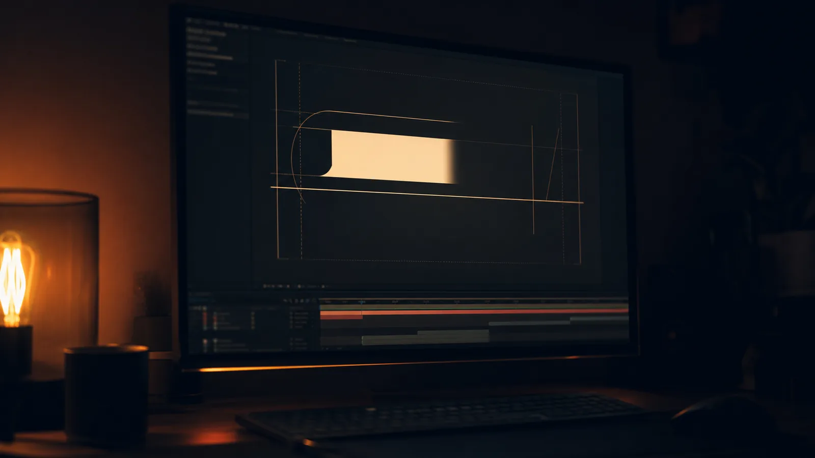
Open a template pack and every title does the same thing: it scales up while it fades in, with a blur, with a light sweep, all at once, over eight frames. It is loud, it is fast, and it is unmistakably a template.
The difference between that and designed motion is almost always subtraction.
One idea per reveal
A title should do exactly one thing, and the thing should relate to the words.
A mask reveal. The words arrive from behind an edge, as if uncovered. It says the words were already there.
A line that draws. A rule extends under the text and stops. It says this is a label, and it is quiet.
Type that moves as a block. The whole line slides in together, holding its shape. It reads as confident and it is the safest choice on a busy frame.
A cut, not an animation. The title is simply there for one frame. On a fast edit this is the most designed option of the four.
What none of these do is combine. A mask reveal with a blur and a light sweep is three ideas arguing, which is what a template is.
The four technical tells
Too fast and too slow at once. Eight frames in, thirty frames settling. Real motion either commits to being quick or commits to being slow, and the giveaway is a reveal that starts violently and then dawdles.
Everything easing the same way. If type, rule and background all decelerate on the same curve, the eye reads it as one flat object rather than a hierarchy. The most important element should settle first.
Letters animating individually when they should not. Per-character animation is a specific effect with a specific feel, usually celebratory, and it makes almost every corporate title look like a competition winner.
A light sweep over anything. It is the single most dated element in motion design and it has been on every template since roughly 2015.
Typography does more than animation
Most of what makes a title look expensive is decided before anything moves.
Tracking that suits the size. A large cap-height line needs tighter tracking than a small one, and a small line needs looser than default. Set this per size, not once.
One typeface doing two jobs, or two that agree. A display face for the line and a neutral sans for the supporting text, with the same optical weight. Three typefaces in a title block is a signature of a template.
A hierarchy with three levels at most. Line, sub-line, rule. Anything more and the viewer reads nothing.
Space around it. A title set close to the edge of the frame looks accidental regardless of how well it animates. Give it margins and let it sit.
The test
Watch the title with the sound off at quarter speed, then at normal speed. At quarter speed a designed reveal still reads as one movement. At normal speed a template reads as a flash and a designed one reads as an arrival.
If the title needs a sound effect to work, it is a template with a soundtrack.
If branding needs a proper motion system rather than a title pack, that is a design job more than an animation one, and it is usually cheaper built once than assembled from parts.