Lower Thirds: What They Are For, and When to Skip Them
Answers how to design lower thirds
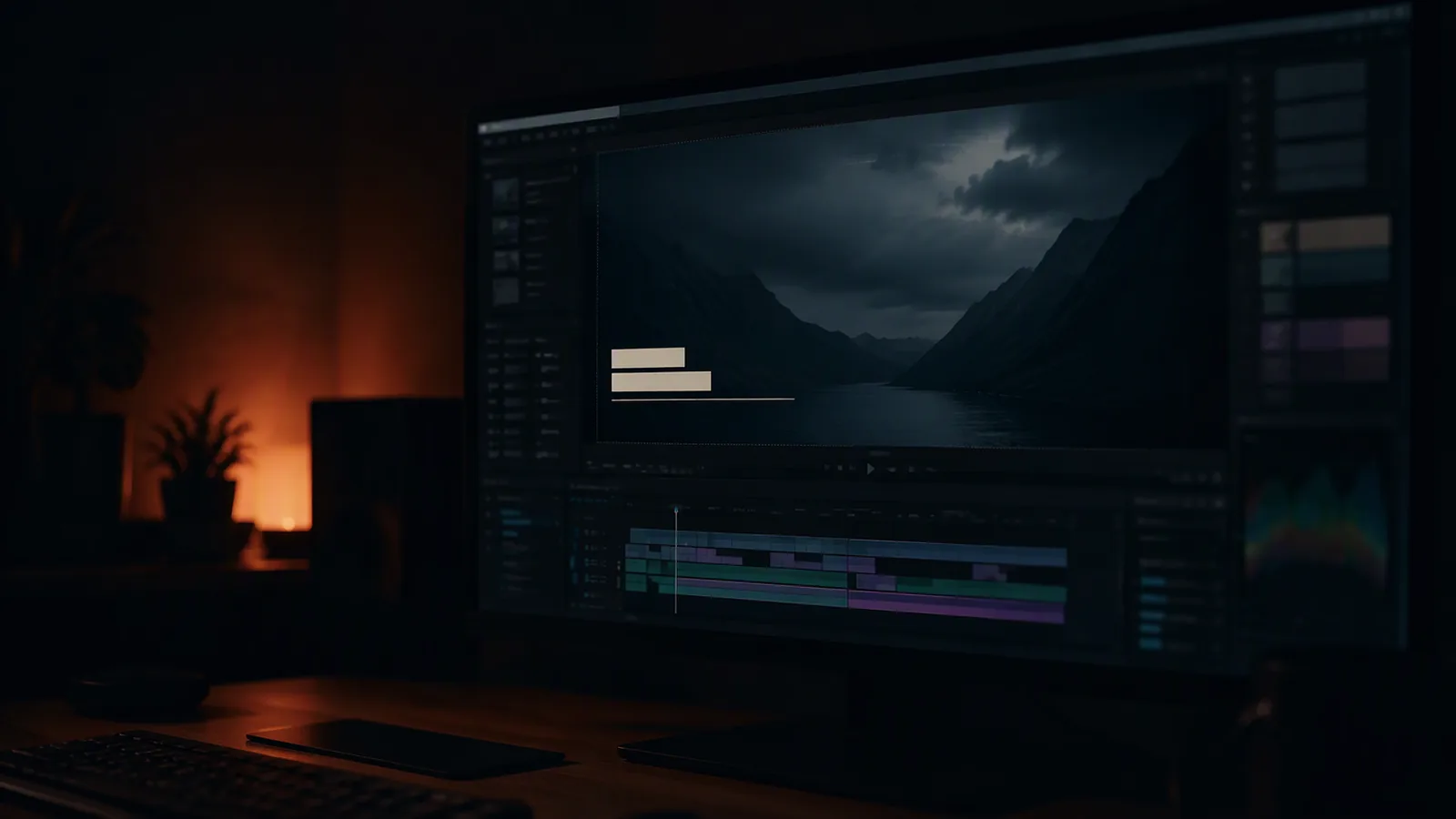
A lower third tells the viewer who is talking, or where they are, or what they are looking at. That is the entire job. Most lower thirds in circulation do none of these well, because they were designed to demonstrate motion rather than to be read.
The four that are worth having
The identifier. A name. It arrives once, for the first time that person speaks, and then never again. Coming back to it is the most common mistake in the format.
The locator. Where we are. One line, at the start of a section, not repeated on every cut within it.
The label. A job title, a company, a role. The part that adds credibility, and the part that should be smaller than the name.
The progress marker. A chapter, a step number. Used when the film has a structure the viewer needs to hold.
The two that are not
The decorative bar. A shape that animates in and out with no words in it. It is in the film because it was in the template.
The recurring ident. The same person's name, again, five minutes later. Nobody has forgotten.
Legibility rules that actually get applied
Size relative to the frame, not to the design. Set it so the name is readable at the size the film will be watched. Which for social is 40 per cent smaller than you think.
Contrast, not colour. A lower third that works on a dark scene and disappears on a bright one is a design problem. Either the type carries its own contrast or the film has to reserve the lower area.
A safe area, decided at the shoot. If captions or lower thirds will sit in the bottom fifth, do not put anything important there. This is a shoot decision, not a post decision, which is why it belongs in the delivery spec.
One typeface, two weights. A display weight for the name and a lighter one for the title, sharing a baseline and an alignment. Three typefaces in a lower third is a signature of a template.
How it should move
One idea, and short.
A mask reveal, where the text is uncovered from behind an edge, is the workhorse. It suits the format because the words appear to have been there already.
A line that draws beneath the text, arriving after it, is a quiet second. It reads as a rule and it settles the composition.
A cut, with no animation at all, on a fast edit. Nothing moves; the third is simply present for the three seconds it is needed. This is used less than it should be and looks the most expensive.
What none of them should do is combine. A mask reveal with a blur, a scale and a light sweep is four ideas arguing, and the viewer reads it as noise rather than as a name.
The duration
Long enough to read twice, and not longer. Roughly two seconds for a name and a title, which is longer than it feels on the timeline because you already know what it says.
The test: play it once at normal speed, then play it and look away. If you cannot say what it said without looking, it is too short or too small.
What this changes for a client
If lower thirds are in the film, decide at the start which ones and how many, because each is a real small job and a system of twelve is a different piece of work from one. It is the difference between a design and a component, and the price difference is honest.
If your film needs names on screen and the brand has nothing to build on, that is a small design job rather than an animation one.